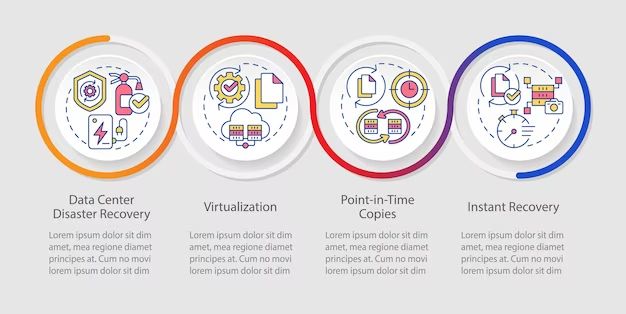
Visualization in the context of disaster recovery refers to the graphical representation of complex data and information related to disaster impacts, response, and recovery efforts. This could involve creating interactive maps, charts, diagrams, and other visual tools to analyze important disaster-related data like damage assessments, resource needs, population movements, infrastructure status, etc. Visualization provides a way to see these data clearly and identify important patterns, trends and insights that inform critical decisions for emergency managers and responders. In disaster recovery, visualization is a powerful tool that improves situational awareness, expedites analysis, enhances coordination, and leads to better outcomes overall. This article will examine the key ways visualization is leveraged across disaster phases and how it ultimately leads to more effective and efficient recovery.
The benefits of using data visualization in disaster recovery are numerous. Most importantly, visualization turns complex disaster data into more easily digestible visuals that provide clarity and focus. Seeing maps, graphs and charts can quickly convey key insights, status, and needs that would take much longer to explain in writing. Visuals also make it easier to spot trends and anomalies that might otherwise be buried in the data. Additionally, visualization facilitates collaboration by creating a common operational picture that allows disparate groups to get on the same page. Overall, data visualization amplifies human cognition in processing complex information, expediting understanding and decision making.
Visualizing Damage Assessments
Visualizations like maps and satellite imagery play a critical role in damage assessments after a disaster strikes. Spatial mapping tools can clearly delineate impact zones, helping response coordinators identify the hardest hit areas that require priority attention. High-resolution imagery provides visual confirmation of the extent of infrastructure damage to roads, buildings, power lines and other critical facilities.
As an example, NASA’s Disasters Mapping Portal integrates satellite data to create near real-time disaster maps displaying damaged areas with a “before and after” view. These visualizations help government agencies and humanitarian responders quickly identify damaged zones and dispatch resources in a timely, efficient manner https://disasters-nasa.hub.arcgis.com/.
Community mapping efforts, like those organized by the Humanitarian OpenStreetMap Team (HOT), leverage crowdsourcing to rapidly map disaster impacts. By enlisting digital volunteers to trace satellite imagery and identify damaged structures, HOT creates open data maps that support rescue efforts in the critical window of time immediately after a crisis https://www.hotosm.org/impact-areas/disaster-risk-reduction/.
Tracking Resources
Visualization tools allow disaster response teams to optimize logistics and track critical resources in real-time. Interactive dashboards can display the locations and status of personnel, supplies, and equipment across affected regions. This provides coordinators with visual awareness of where resources are needed most urgently. For example, during the aftermath of Hurricane Harvey, the State of Texas used Esri’s ArcGIS platform to create maps and dashboards to direct relief efforts and commodities. The visualizations helped officials identify isolated communities in need and route appropriate aid more efficiently.
Resource tracking dashboards may incorporate dynamic mapping, data overlays, and analytics. authorized users can input data on inventories, supply levels, infrastructure status, and more. The dashboards instantly process this data into intuitive visuals. Responders can then optimize logistics based on visualized trends and insights. Advanced systems may even suggest optimal distribution or deployment of resources based on integrated algorithms. Overall, real-time visualization and tracking of relief supplies, equipment, and personnel allows for more agile, informed logistics.
Analyzing Trends
Visualizations can play a key role in analyzing trends during disaster recovery. By plotting relevant data like affected populations, damage, and resource needs over time, analysts can identify patterns that help predict future needs. For example, mapping the progression of damaged areas over a multi-week period after a hurricane landfall can illustrate the potential spread and duration of impacts. Analyzing trends in resource requests and shortfalls across responders and recovery organizations also aids planning. According to a 2022 report by Our World In Data, visualizing long-term global trends in disaster mortality reveals the effectiveness of preparedness efforts and interventions.[1] Overall, data visualizations empower analysts to spot trends, make projections, and recommend actions to improve future disaster planning and response.
Coordinating Responders
Interactive maps enable disaster response teams to easily coordinate search and rescue efforts, locate critical infrastructure and services, and track response activities in real-time. GIS provides a common operational picture that connects data to maps, allowing responders from different agencies to visualize the same information and work collaboratively.
Some key uses of GIS for coordinating responders include:
- Tracking the current locations of response units and assets using GPS
- Sending maps and critical information directly to mobile devices used by response teams in the field
- Creating search grids and assigning areas to different response units
- Generating optimal routes to impacted sites considering road closures and hazards
- Monitoring operations and deploying resources using real-time dashboard views
- Sending alerts about changing conditions, new hazards, and updated incident boundaries
By leveraging GIS, emergency managers can gain enhanced situational awareness and more efficiently direct operations across agencies and jurisdictions. Real-time tracking and alerts enabled by GIS improve coordination and help responders provide services safely and effectively.
Informing the Public
Using visualizations to inform the public during a disaster is crucial for promoting awareness, safety instructions, and updates. Maps and infographics can quickly communicate news and instructions in an easy-to-understand graphical format.
For example, after Hurricane Harvey, the City of Houston used interactive maps to share real-time flooding information, road closures, and shelter locations with residents (https://www.linkedin.com/advice/3/what-some-creative-ways-use-data-visualization-crisis-hmgcf). Infographics helped illustrate safety precautions like turning off gas lines and electricity when evacuating flood zones. Color-coded maps of the storm’s path showed potential high-risk areas.
The Red Cross creates and shares infographics with preparation checklists and emergency kit essentials before an impending disaster strikes a region. During wildfires, maps can plot the fire perimeter and project the likely direction it may spread. After disasters, public agencies can publish interactive maps of damage assessments, road closures, shelter locations and recovery resources (https://stamen.com/visualizing-critical-disaster-data-with-readymapper/).
By leveraging visuals to broadcast urgent information and instructions, public officials and relief organizations can rapidly inform and mobilize affected populations during disasters.
Simulating Scenarios
Visualization technology allows disaster response teams to simulate various emergency scenarios in order to improve preparedness. Sophisticated simulation software can model hurricanes, floods, earthquakes and other disasters in rich detail. As described in an article on LinkedIn, “The visualizations are based on actual data from previous disasters, with the goal of making the simulations as lifelike as possible” (source). These vivid simulations enable responders to envision unfolding events and test their readiness through hypothetical emergency response plans.
By modelling worst-case scenarios, disaster planners can identify weaknesses in their strategies and improve their preparations accordingly. As explained in a journal article, simulation training systems with advanced visualization are being developed specifically for disaster prevention and emergency response (Li, 2022). Visualization tools essentially allow responders to gain experience through simulated practice runs. When real-life disasters eventually do occur, teams will be better equipped to take appropriate actions thanks to these engaging training visualizations.
Monitoring Recovery
Dashboards provide an effective way to monitor disaster recovery efforts and track rebuilding progress. With real-time data visualization, dashboards give responders a clear picture of recovery operations. Key metrics can be displayed on a single screen to identify areas needing more resources or attention.
For example, the AWS Elastic Disaster Recovery System includes a Recovery Dashboard to monitor the status of replicated servers and data. This allows admins to ensure systems are being restored properly during the recovery phase. The dashboard shows data replication and events from AWS CloudTrail to provide insights into the recovery process.
Similarly, the Commvault Disaster Recovery Dashboard centralizes critical information to visualize recovery. It tracks replicated data, virtual machines, recovery plans, and more across on-prem and cloud environments. This unified view helps coordinate disaster recovery efforts across teams and locations.
With data visualization dashboards, disaster recovery leaders can better identify gaps, trends, and progress. This enables them to make data-driven decisions on where to focus resources to accelerate the recovery process.
Enhancing Decision-Making
Visual analytics and data visualization play a critical role in enhancing data-driven decision making during disaster response and recovery. Interactive dashboards allow emergency managers to visualize complex data sets on demand and identify trends, patterns, and relationships that optimize decision making (FEMA Drives Better Decision-Making for Disaster Planning and Relief with Interactive Dashboard). By leveraging real-time data feeds and geospatial mapping, stakeholders can monitor evolving conditions, analyze trade-offs, and make evidence-based decisions about where to deploy resources and how to coordinate response efforts.
Visualization analytics empower responders to allocate resources in an agile and efficient manner as needs shift on the ground. Mapping tools track resources and team locations, helping managers match capacity to demands across the affected region. Dashboards allow for scenario planning to evaluate different response strategies. By enhancing situational awareness and operational understanding, data visualization facilitates rapid and adaptive decision making amidst the uncertainty of disasters.
Conclusion
As we’ve seen, data visualization provides immense value in disaster recovery efforts in numerous ways. By enabling responders and decision makers to clearly see damage assessments, resource needs, trends, and simulations, visualization enhances situational awareness and allows for more targeted, effective action. Visuals help coordinate responders while also keeping the public informed.
Looking ahead, continued advances in data collection and analytical capabilities will further expand the role of visualization in disaster response. With real-time data feeds from satellites, drones, sensors, and more, visualizations will become increasingly dynamic and detailed. Augmented and virtual reality could take visualization to new immersive levels. The future is bright for data visualization to help save lives and speed recovery during disasters.